MODULE 1 - Introduction to Graphic Arts
BRIEF 1 - Information Design
BRIEF 1 - Information Design
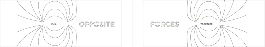
INFORMATION DESIGN
|
One of the most insightful explanations of information design comes from Michael Evamy in his book, 'World without Words', he says;
‘Information design is the kind that slips silently by us, all the time, every day. Yet it exerts a special kind of authority over us. In fact, it is the kind of design that could come to form the graphic imprint for our age. It performs a function that is increasingly in demand in our world: that of imparting information without words.’
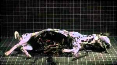
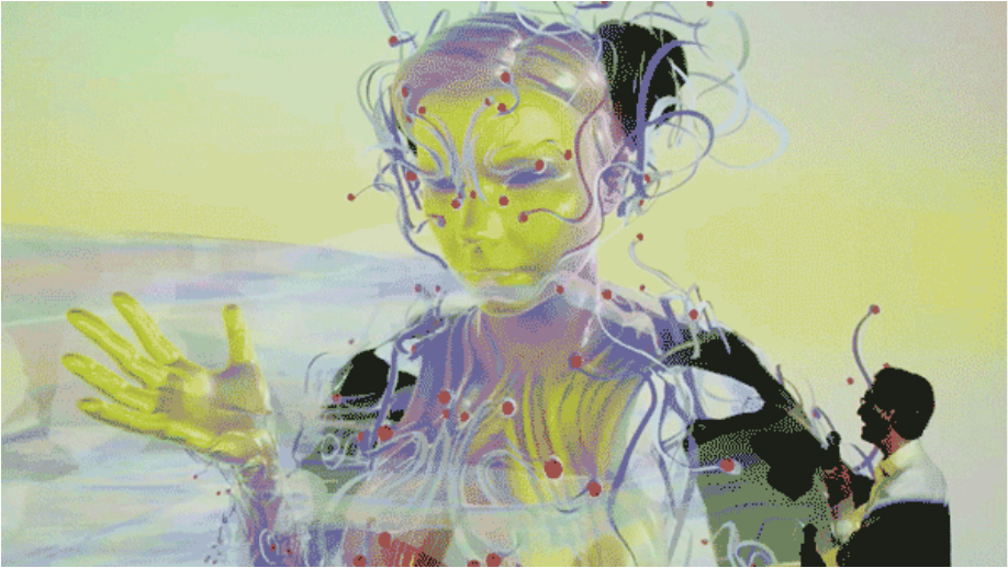
This Royksopp music video for the track Remind Me is a nice illustration of how information design is constantly with us and shapes, informs and guides our day to day living.
INFORMATION DESIGN - HISTORY
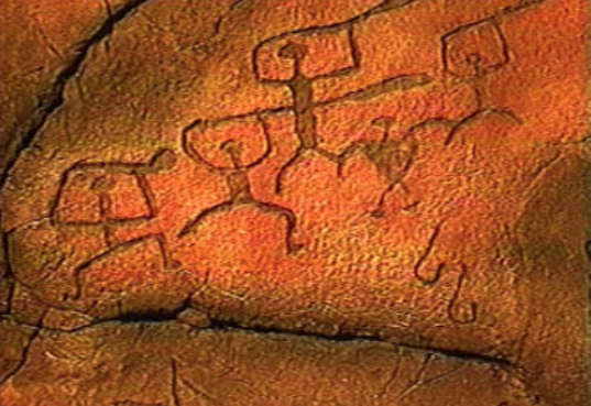
Petraglyphs - prehistoric
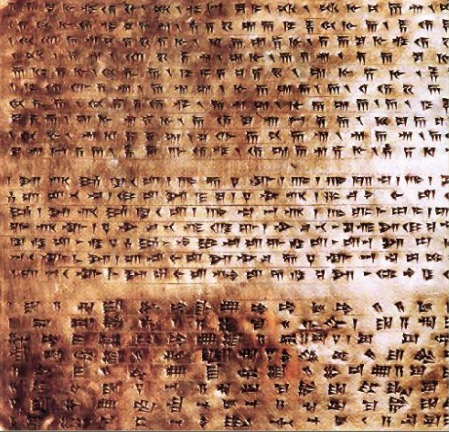
Sumerian Cuneiform - Southern Mesopotamia more than 5000 years ago
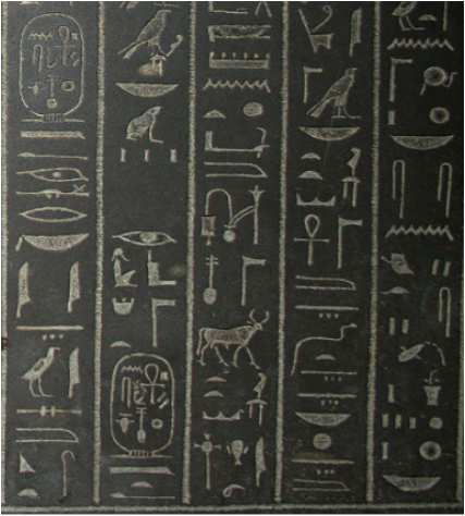
Egyptian Hieroglyphs - around 4000BC Image as language
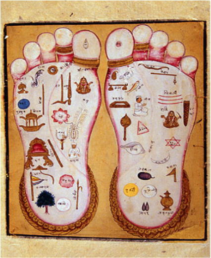
Sacred Hindu text - The Vedas
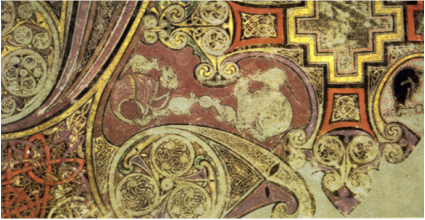
The Book of Kells - Symbols and images used in religious texts such as the Book of Kells , contains the four Gospels of the Christian scriptures – around 800 AD
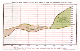
Charles Minard (1861)
Representation of Napoleonic Army’s failed Russian campaign of 1812. The first major work to contain statistical graphs. Minard’s' map is a brilliant combination of statistical information (troop numbers and temperature variations) and topographical data (direction, distance, and location). 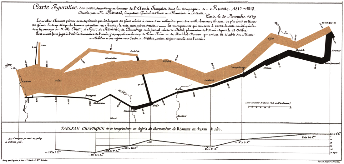
Nicholas Oresme (French Bishop and Philosopher - 14th Century) The first known graphical representation of change.Oresme plotted data on two axis, and represented phenomena such as velocity against time.
|
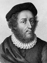
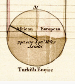
William Playfair (1759 - 1823)
Scottish engineer and political economist, who is considered the founder of graphical methods of statistics. Playfair invented four types of diagrams: in 1786 the line graph and bar chart of economic data, and in 1801 the pie chart and circle graph 
One of Playfair’s piecharts in his Statistical Breviary published in 1801, depicting the proportions of the Turkish Empire located in Asia, Europe and Africa before 1789.
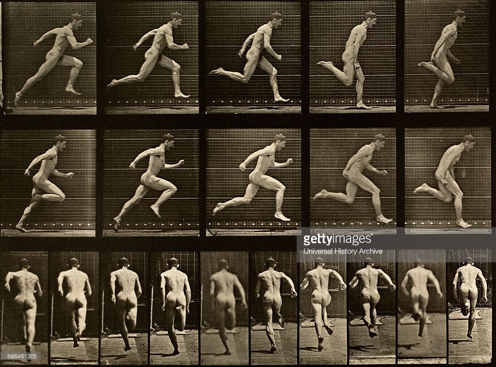
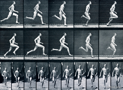
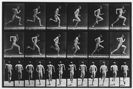
Florence Nightingale
After the Crimean War (October 1853 – February 1856), Nightingale used the polar area diagram, equivalent to a modern circular histogram or rose diagram, to illustrate seasonal sources of patient mortality in the military field hospital she managed. She used these diagrams to present reports on the nature and magnitude of the conditions of medical care in the Crimean War to Members of Parliament and civil servants who would have been unlikely to read or understand traditional statistical reports 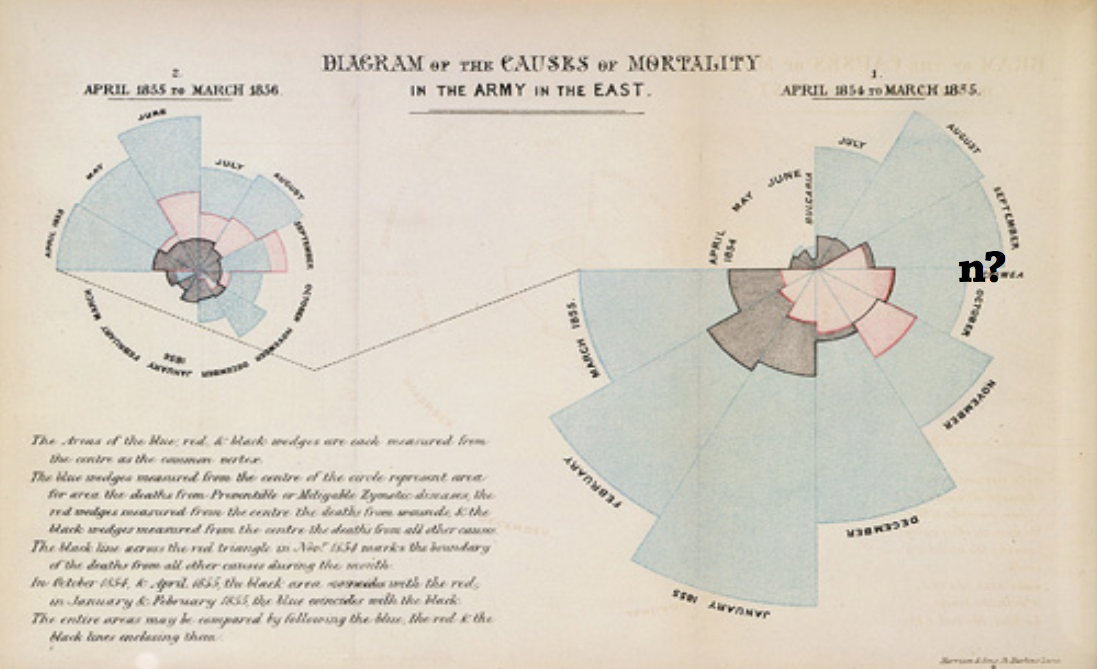
Otto Neurath
“WORDS SEPARATE, PICTURES UNITE” Born in Austria in 1882, philosopher, economist and social scientist. In the early 1920’s he developed a system of an international picture language as an alternative to written script.
ISOTYPES (The International System of Typographic Picture Education) over 2000 symbols which could be combined to give different meanings 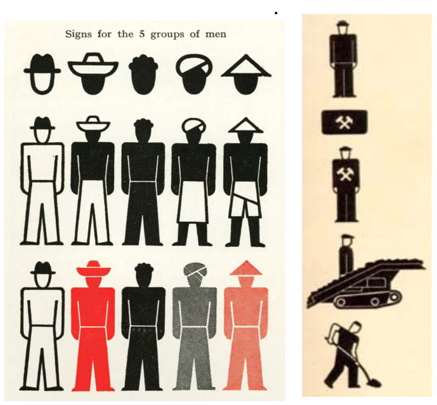
He had very ambitious plans for his ‘visual dictionary’, - he predicted that;
“The isotype method may very well become one of the factors that will help to bring about a civilisation where all people share a common culture and where the gulf between educated and uneducated will be bridged” Gerd Arntz
The designer tasked with making Isotype pictograms and visual signs. Eventually, Arntz designed around 4000 such signs, which symbolized key data from industry, demographics, politics and economy. 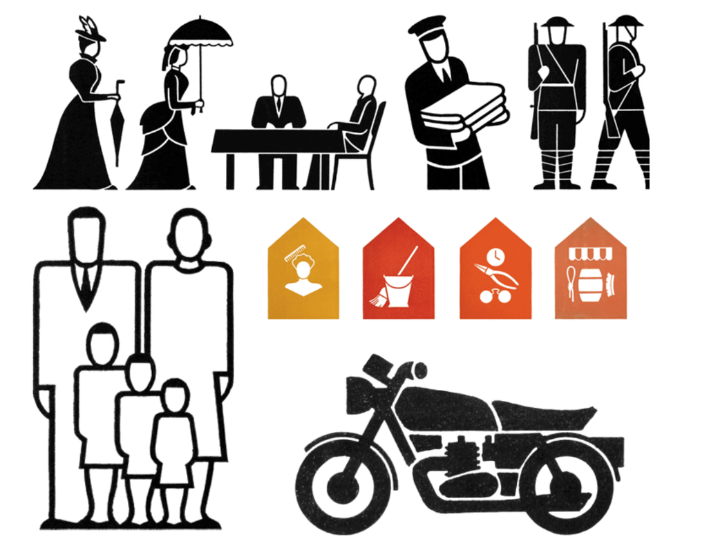
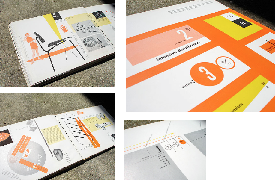
Ladislav Sutnar
Born in Czechoslovakia on November 9, 1897 Catalog Design Progress Born in Czechoslovakia, Ladislav Sutnar was a pioneer of information design. Working in America in the years after the war he synthesised European avant - gardisms (modernism) into a functional commercial vocabulary. He made Constructivism playful and used its geometry to forge the dynamics of catalogue organisation. The graphic systems he created for a range of American businesses clarified and made accessible vast amounts of complex information and transformed routine business data into digestible units. 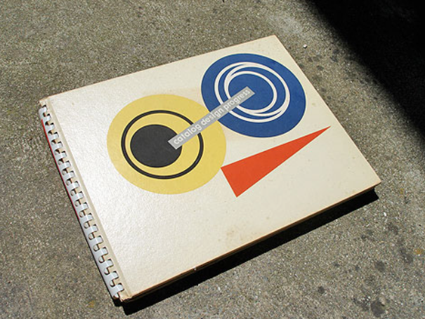
Jacques Bertin
French cartographer and theorist, known for his book Semiologie Graphique (Semiology of Graphics 1967) Semiology of Graphics is an attempt to synthesise the principles of graphic communication with the logic of standard rules applied to writing and topography. The book includes more than 1,000 maps and diagrams to illustrate and examine graphic techniques including shape, orientation, colour, texture, volume, and size. 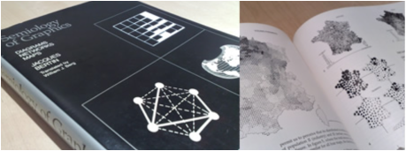
|
‘Even though we navigate daily through a perceptual world of three spatial dimension and reason occasionally about higher dimensional arenas with mathematical ease, the world portrayed on our information displays is caught up in the two dimensionality of the endless flatlands of paper and video screen. All communication between the readers of an image must now take place on a two-dimensional surface.......... for all the interesting worlds (physical, biological, imaginary, human) that we seek to understand are inevitably and happily multivariate in nature. Not flatlands.’
|
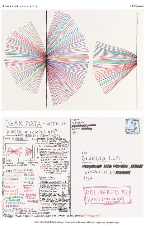
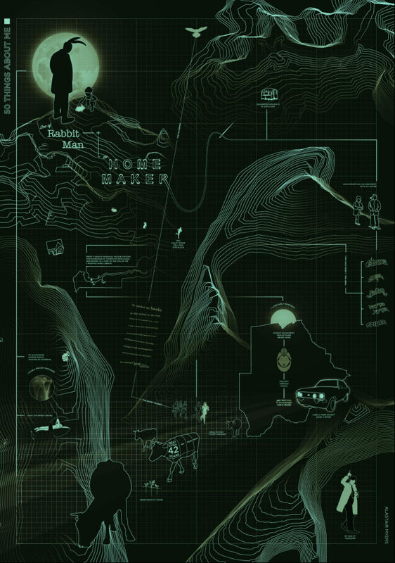
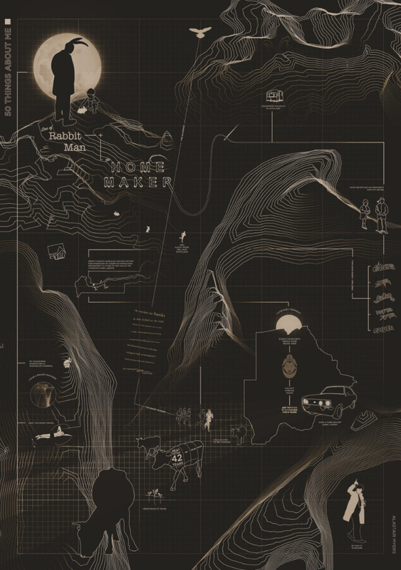
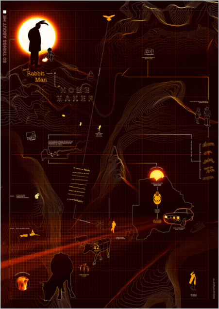
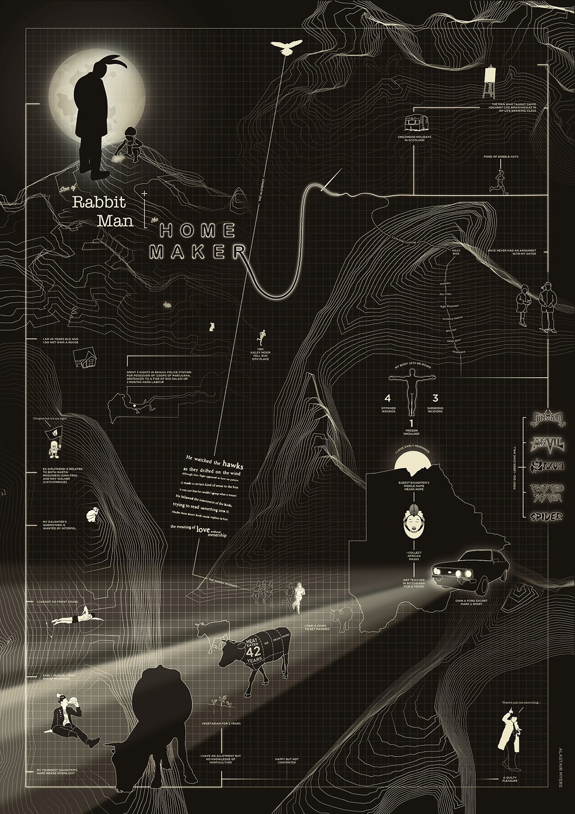
Dear Data
The piece below, A week of indecision! , taken from the Dear Data project (Giorgia Lupi and Stefanie Posavec) kind of sums up my current state of mind following week one's presentation of 10 things about me!). The project contains some wonderful examples of analogue data drawings that were exchanged in the form of postcards sent between the two designers. Really like the personal, hand drawn data vis style, could be something to investigate for the 50 things about me task. Without the key and some explanation on the back of the postcards, the images are purely beautiful abstract images. 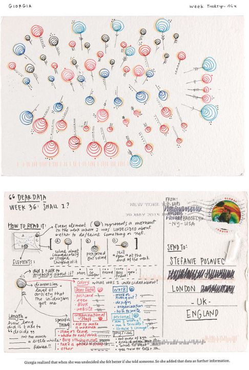
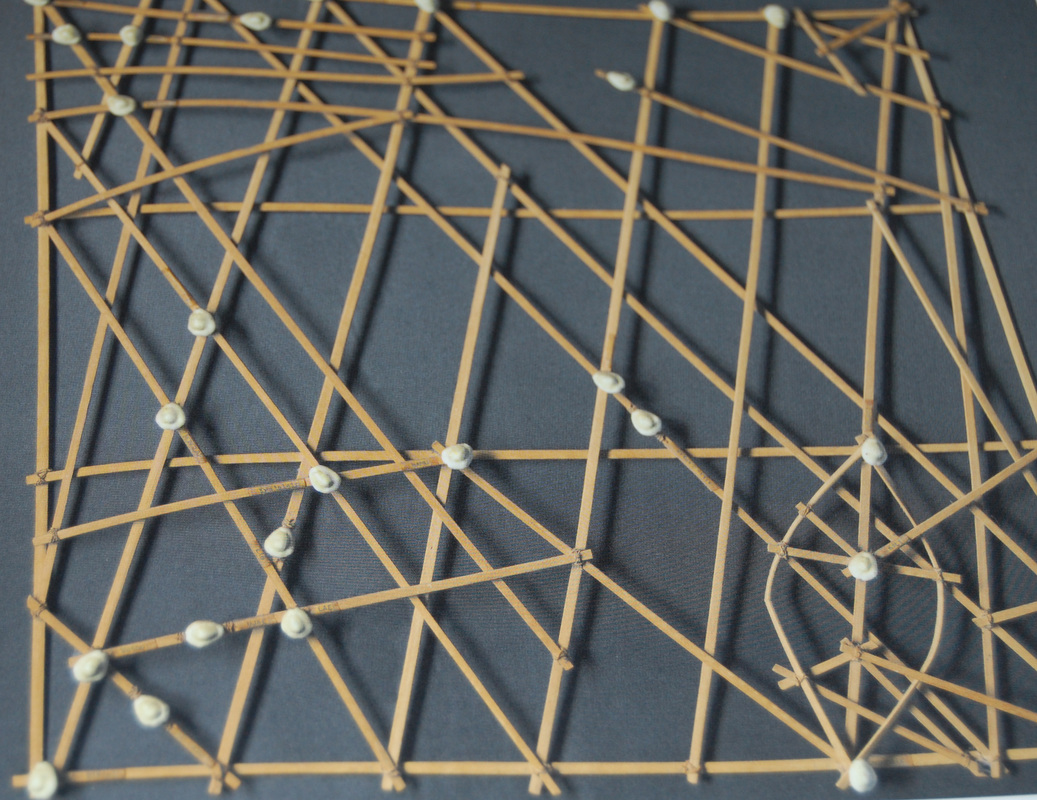
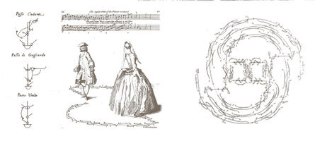
Stick Charts of the Marshall Islands
Stick charts like this were used by navigators of the pre-literate society of the Marshall Islands of the South Pacific until about the time of World war II. Shells and pieces of coral recorded the positions of islands, while the palm ribs show the locations and directions of ocean swell patterns. Such charts were probably used in conjunction with celestial observations to sail outrigger canoes between the hundreds of islands 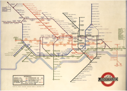
The London Underground Map - Harry Beck
Beck, then 29, had been employed as a ‘temporary’ since he first started in 1925. While at work drawing an electrical circuit diagram, he had an idea: a new map that would raise the profile of the tube and attract much-needed new passengers, and that would make the system seem modern, quick, efficient – and, above all, easier to navigate. Harry laid out London’s Underground routes as he would a circuit board, and took it to the publicity department. He told Garland: ‘Looking at the old map of the railways, it occurred to me that it might be possible to tidy it up by straightening the lines, experimenting with diagonals and evening out the distances between stations.’ 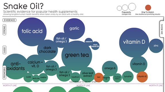
Snake Oil - David McCandless
Snake Oil Supplements? Scientific evidence for popular health supplements. Showing tangible human health benefits when taken orally by an adult with a healthy diet (Sep 11th 2015) THE PROJECT - work in progress
|
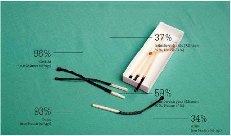
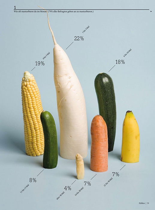
Sarah Illenberger
Sarah Illenberger creates vivid, often humorous images that make stories come to life. Whether big or small, abstract or complex, the subjects and problems of our times are pointedly depicted by this renowned illustrator and designer in concise visual forms. Meticulously created at the intersection of photography, art, and graphic design with analog handicraft and using everyday items, her richly detailed work opens up new perspectives on the seemingly familiar. 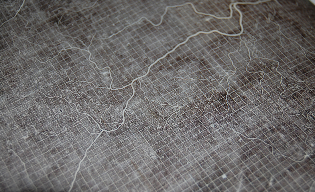
The Map of the tracks of Yu
A map of China's river network produced during the Jin or Jurchen dynasty (1115-1234), is remarkable for a number of reasons, not least for being the oldest surviving Chinese map. The map was carved on to a 1-metre-square (3-foot-square) stele, or stone pillar, so that visitors could make copies by taking rubbings. It was the first map to use a grid, with 50 km apart. 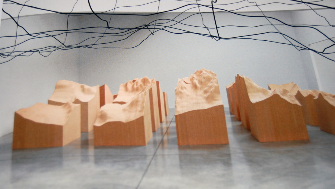
Water Line and Blue lake pass - 2006 maya Lin
For these two installations - displayed as part of three Ways of Looking at the Earth in 2009 - the American artist Maya Lin used models, grids and topographic drawings as well as more advanced technology (sonar and radar mapping, satellite photographs) to study parts of the world that are inaccessible or impossible to observe in their entirety. Water Line is a scale map of the ocean floor along the Mid-Atlantic Ridge as it ascends to Bouvet Island, one of the world’s remotest places, located roughly 1,600 kilometres (1,000 miles) north of Antarctica. Lin transforms data gathered by scientific expeditions into a three-dimensional, suspended-wire line-drawing, enabling viewers to pass beneath the undulating terrain. Blue Lake Pass refers to a specific area of south-western Colorado familiar to the artist from family vacations. Lin imposed a 91 cm x 91 cm (3 ft x 3ft) grid on a section of terrain from the Rocky Mountains, which was then scaled down and sectioned into twenty individual units arranged in a grid with narrow passageways between. The uneven, rugged peaks contrast with the uniform grid, reminding viewers of the contrast between the disorder of the natural world and human attempts to systematize and order it through mapping. 
Designing for universal understanding!
One of the images placed on a phonograph disc on board NASA’s voyager One and Two space probes in 1977, intended to communicate the story of earth to extraterrestrials. Images designed to relate the most fundamental features of human existence 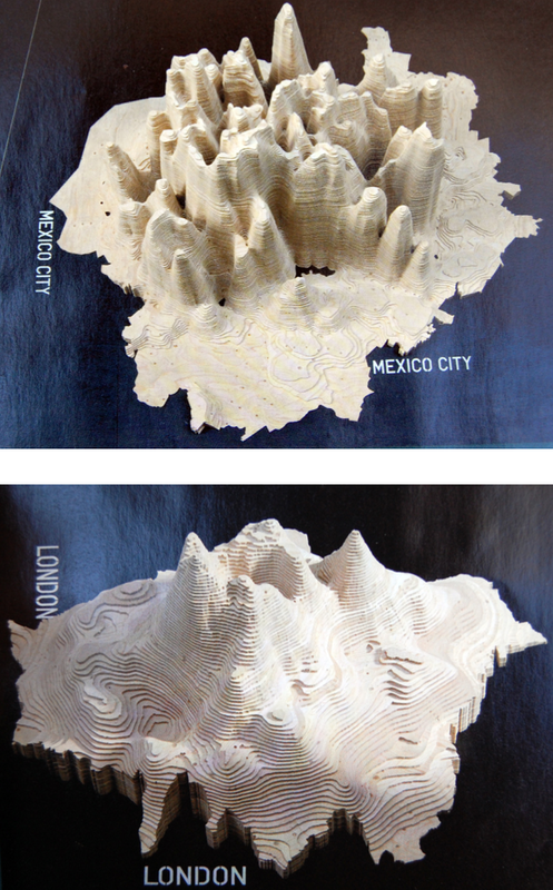
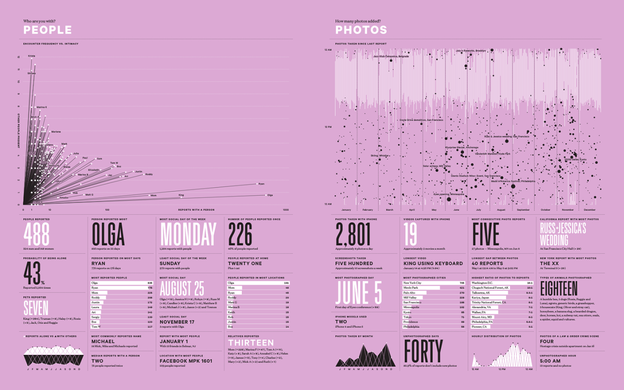
Nicholas Feltron
Sample page from one one of Nicholas Feltron's Feltron reports. He is the author of Personal Annual Reports that weave measurements into a tapestry of graphs, maps and statistics to reflect the year’s activities. 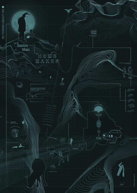
|
|
|
|
DAVID HOCKNEY
GERMAN EXPRESSIONISM
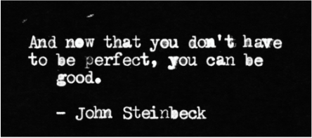
JOHN STEINBECK
“And this I believe: that the free, exploring mind of the individual human is the most valuable thing in the world. And this I would fight for: the freedom of the mind to take any direction it wishes, undirected. And this I must fight against: any idea, religion, or government which limits or destroys the individual. This is what I am and what I am about.” PETER GREENAWAY
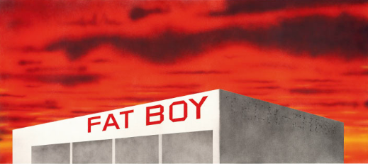
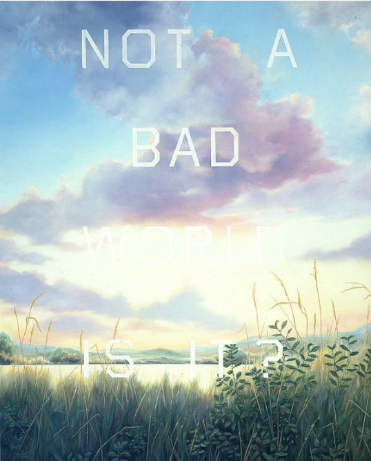
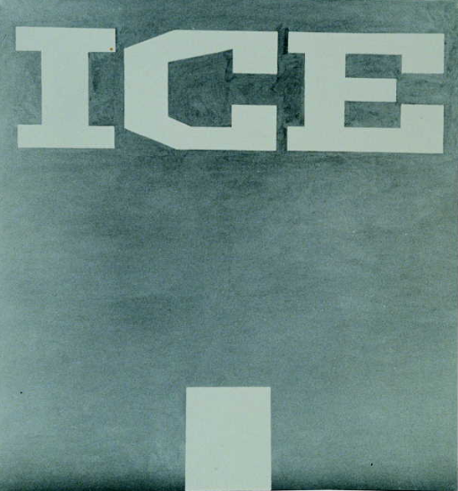
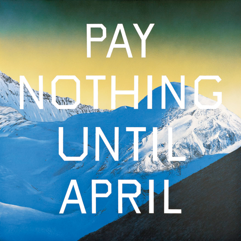
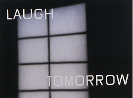
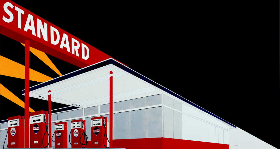
ED RUSCHA
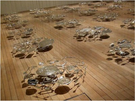
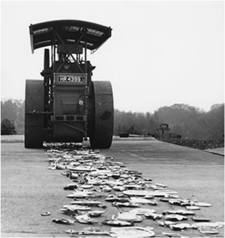
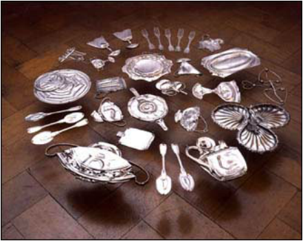
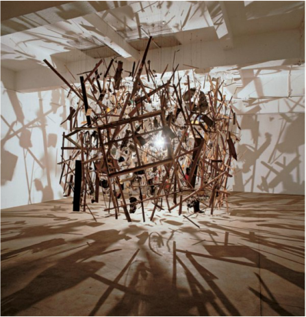
CORNELIA PARKER
VAUGHAN OLIVER
STEFAN SAGMEISTER
JONATHAN BARNBROOK
NEW WAVE TYPOGRAPHY
‘My work is like a quarry. People see a stone they like, appropriate it and work it until there’s nothing left.’ BJORK
|
|

|
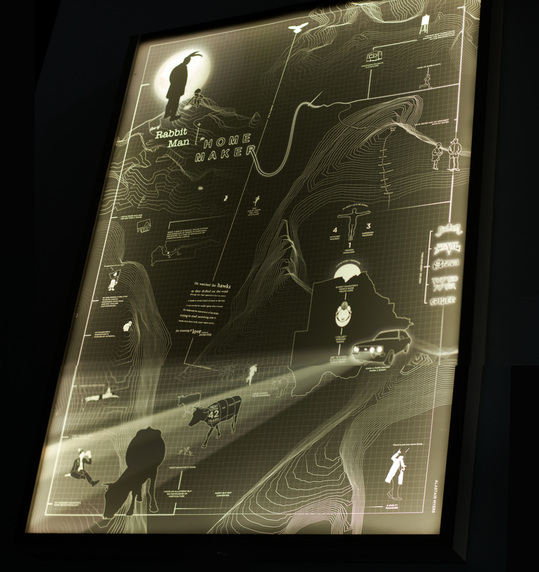
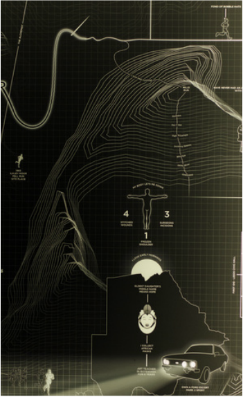
BREAKING BAD: FROM BELOW - This animation ties in well with this week's workshop!
Velocity (Trailer) from karolina glusiec on Vimeo. |
GEORGE DUNNING - Damon the Mower
Hansel + Gretel from YELLOWSHED on Vimeo. An abstract visualisation of Brothers Grimm's 'Hansel + Gretel'. (2014)
Techniques: mixed media including drawing on paper, paper cut outs, sand & live action (Concept, Direction & Art Direction: Soyeon Kim) Sewing Test from Heather Kai Smith on Vimeo. |
|
|
|
|
|
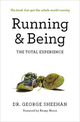
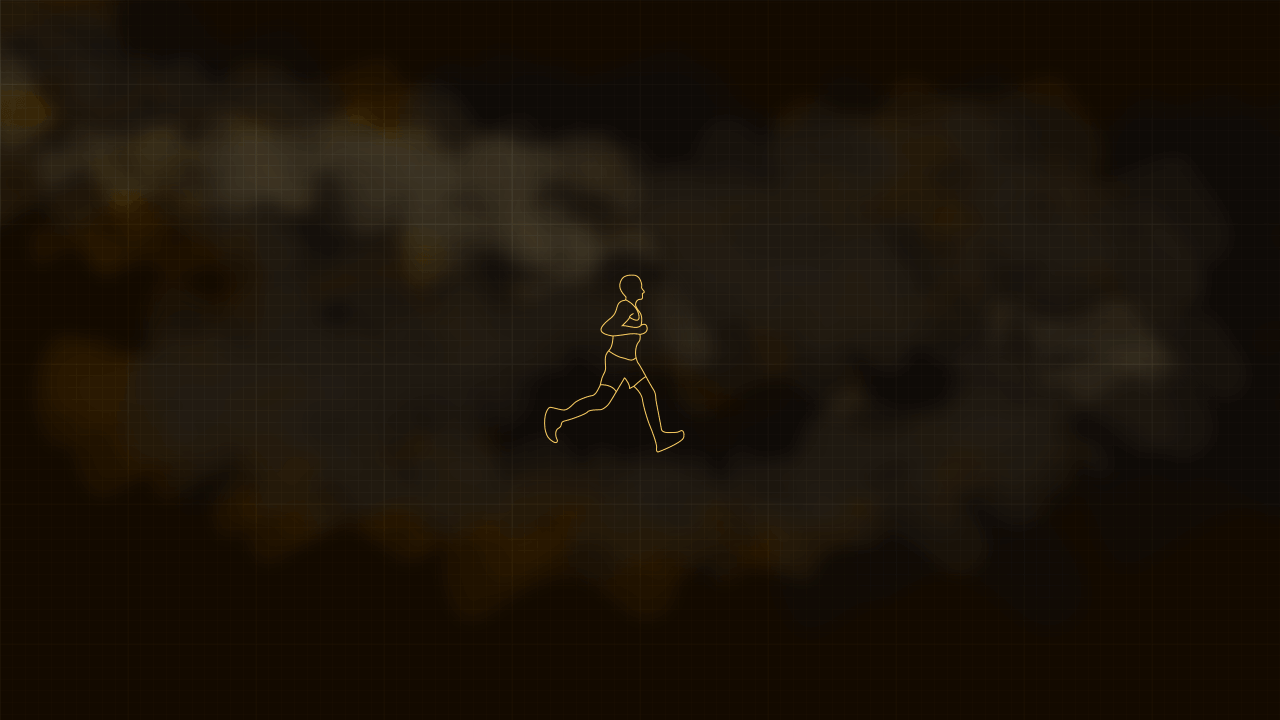
RUNNING & BEING |
|

|
|
The word manifesto traces its roots to the Latin manifestum, which means clear or conspicuous. A manifesto is defined as a declaration of one’s beliefs, opinions, motives, and intentions. It is simply a document that an organisation or person writes that declares what is important to them. A manifesto functions as both a statement of principles and a bold, sometimes rebellious, call to action. By causing people to evaluate the gap between those principles and their current reality, the manifesto challenges assumptions, fosters commitment, and provokes change.
While manifestos are traditionally public declarations, every man can also have a personal manifesto.
"Whereas conventional background music is produced by stripping away all sense of doubt and uncertainty (and thus all genuine interest) from the music, Ambient Music retains these qualities. And whereas their intention is to "brighten" the environment by adding stimulus to it...Ambient Music is intended to produce calm and a space to think."
Brian Eno


|

|

|
|

|

|
|
|

|
|
|

|
|
|
‘Our understanding of the aesthetics of information is enriched by examining dance narratives and their visual texture. We come to appreciate how the underlying designs bring about and enable the joy growing from the complexity, from finding pattern and form amidst commotion. “How beautiful it was then,” writes Italo Calvino about a time of radiant clarity in cosmic prehistory, ‘through that void, to draw lines and parabolas, pick out the precise point, the intersection between space and time when the event would spring forth, undeniable in the prominence of its glow ...’ |
|